I was going to just post a screenshot to twitter, but this is far too impressive to let die in a stream somewhere. i wanted to keep this in my records to draw inspiration from weeks and months from now.
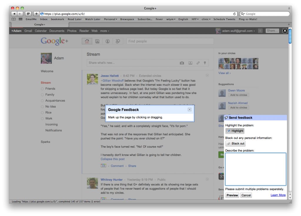
In Google+, like many websites, there is a Send Feedback button. It is unassuming.
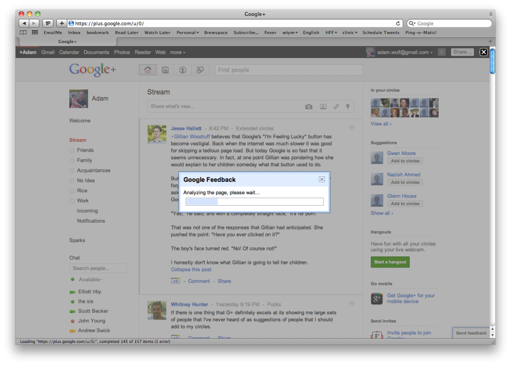
But when you click it, you don’t get a boring “yeah what?!” text box, instead, in true Google fashion, the Google analyzes the page before the form shows:
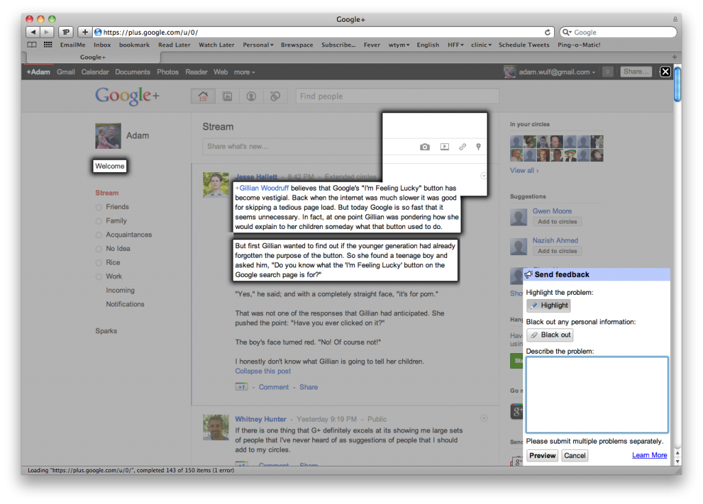
And then it asks you to draw on the page to annotate your feedback!

You can draw boxes and select elements on the page. It’s quick, easy, slick, amazing, neat, and useful.

Extremely polished stuff. If i were to guess, the quality and usefulness of the feedback they receive is unparalled compared to other sites feedback mechanisms. Extremely cool stuff. I wish they would package it up as a product, maybe paired with Google Analytics, and let any site user embed that feedback system into their own site. Extremely cool.
And the fact that it’s on Google+ is particularly interesting. Its such an easy to use and useful tool that I wish I could use it to share content with others. Browse to site, “neat!”, click share/crop tool, click “post to Google+”, done. Reminds me of Scoble’s interview of Convofy (forgive Scoble’s lousy recording, but that few minutes of the video is pretty slick stuff.)
Update:
Turns out it may very well be its own Google product according to this Quora question. Tell Google here to be notified if/when it’s released.

how can i get it?